5 Best Practices for Front-End Web Development
May 9, 2018
Coding knowledge is a must-know for those not only seeking to have a career in front-end web development but for those looking to get involved with digital marketing as well. A basic understanding of coding and front-end web development is key to mastering search engine optimization (SEO). Front-end web developers are in hot demand now by both businesses and marketing agencies alike. If you’re a front-end web developer, here are some front-end best practices you might consider exploring or adopting to streamline your workflow.
Make Sure Your Code Is Legible and Easy to Follow
While writing code that’s concise and legible isn’t mandatory, it will save you (and any developer who works on it) many headaches in the future. Think about it; the chances of writing code that will never be changed or never looked at again are slim to none, and time spent getting lost in old code is time wasted. Below are some key web development best practices for the three native web languages.
HTML
Indentation
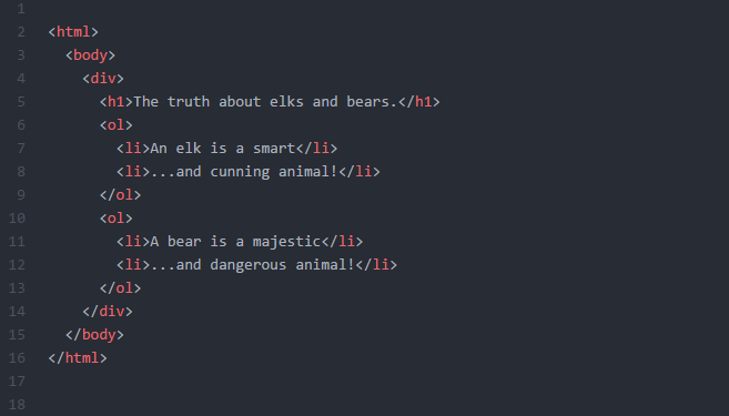
Use indentation as a visual representation of nested elements. Your most recent opened tag is always followed with a closing tag and placed in the proper order to ensure your code operates as it should and is nested. This can be seen in Figure 1 along with indentation made, which makes it easier to organize visually. If necessary, add blank lines to separate large code blocks.
Semantic Elements
Semantic elements are elements with tags that clearly define the content included for both the developer and the web browser. Basic HTML includes tags such as <b> to represent bold and <i> to represent italics. HTML5, the most current version of HTML, introduced support for semantic elements, where <strong> represents bold and <em> (emphasis) represents italics.
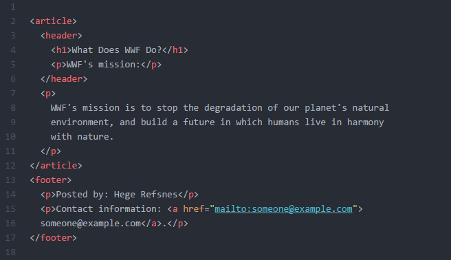
Semantic elements are more commonly used by developers today and improve the automated processing of documents — all mainstream browsers such as Google Chrome, Mozilla Firefox, and Apple Safari support HTML5 and semantic elements. Web developer reference sites such as w3schools offer a full list of HTML5 semantic elements for easy reference.
Class and ID Names
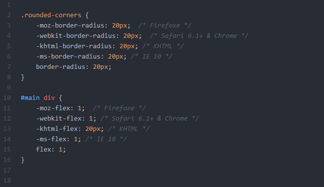
Using both class and ID names are practical and relevant HTML practices to define an element. In HTML, the class attribute is used to define the specific styling of an element. Class attributes can be reused between multiple elements, allowing for elements to carry identical modifiers.
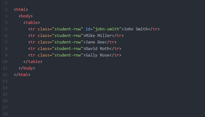
An ID tag is used to define a specific variable and can be used alongside a class attribute. IDs are assigned to only one specific element and should never be reused. This allows for specific customization to the element using the ID tag without affecting others inside the same class.
CSS
Cascading Style Sheet, or CSS, is behind almost everything you see when you visit a website. While HTML is responsible for the content your website possesses, CSS is what visually stylizes your content and website.
CSS Reset
Many web browsers add their styling by default, and each web browser may apply styles in their own unique way. For example, many browsers make links blue and visited links purple by default. Others may give tables a certain amount of border and padding. Utilizing a CSS Reset is a great practice to reset them all and style from the ground up.
A CSS Reset, or Reset CSS, is a short and often compressed (minified) set of CSS rules that resets the styling of all HTML elements to a consistent baseline. Using a CSS Reset will allow you to force every browser to have all its styles reset to null. This can help avoid cross-browser differences.
We recommend you use HTML5 Doctor’s reset.css code template for your CSS file.

Consistent CSS Structure
The structure of your CSS file should remain consistent with the structure of your HTML file. This can benefit both you and those who may have to make adjustments to your files in the future. If your CSS code is all over the place and doesn’t follow the same pattern and flow as your HTML document, it will likely take a lot of time and effort to make sense of the two before changes are made.
Inline Style
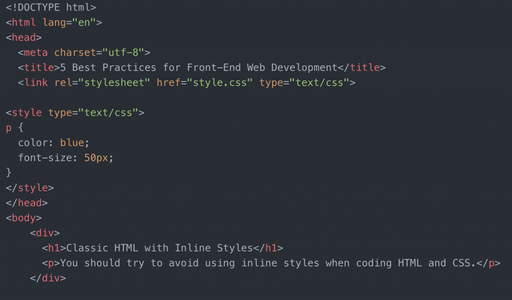
Typically, CSS is written in a separate CSS file with the .css file extension. Inline styles are CSS sheets included within the HTML document itself. This practice should almost always be avoided when writing HTML and CSS code.
When to Use Inline Styles
While most professional web developers refrain from using inline styles, there are some exceptions to when they should be used. Some examples of that would be:
- HTML Email
- Content Management System Content (WordPress, Drupal, etc.)
- Dynamic Content (HTML created or altered by JavaScript)
- Older Websites
JavaScript
JavaScript is the programming language of HTML and the Web. JavaScript is used by more than 90 percent of all websites on the Web as they assist in creating a dynamic and interactive web page.
There are several popular JavaScript frameworks you should know as a web-developer. Frameworks are large bodies or many classes of pre-written code that you may add to your own code. Utilizing these frameworks can allow you to finish the creation of JavaScript applications quickly.
Popular JavaScript frameworks that many web-developers take advantage of are:
Naming Variables
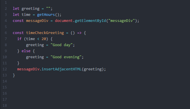
When using JavaScript, you should always use variable names that make sense. For example, if you’re grabbing an element by ID from your HTML file and have stored it in a variable, it’s a good practice to use that same name for your new JavaScript variable.
It’s common to use camelCase, a writing practice that involves writing each word or abbreviation in the middle of the phrase to begin with a capital letter, with no intervening spaces or punctuations. iPhone or eBay are real-world examples of camelCase being applied.
Use Indentations
You should always use indentation for functions, objects, and conditionals to make them easier to read and differentiate them from other parts of the code.
Comments
In all three cases, commenting is very important. When you analyze a piece of code, you cannot tell if it’s correct unless you understand what it is supposed to do. A good comment will be able to tell you exactly what a specific piece of code is supposed to accomplish.
However, if your comments are unclear or redundant, you or those who work with your code may have a hard time understanding the original intent of the code itself. Your comments should explain why it functions the way it does and what the overall goal of the code is.
Design for All Browsers and Devices
The days of designing for strictly desktop screens have passed. As of 2016, mobile web browsing surpassed browsing on a traditional computer. The most efficient way to deal with this change is to design a site that can adapt to the size of the viewport. This is where responsive web design comes in.
Responsive Web Design
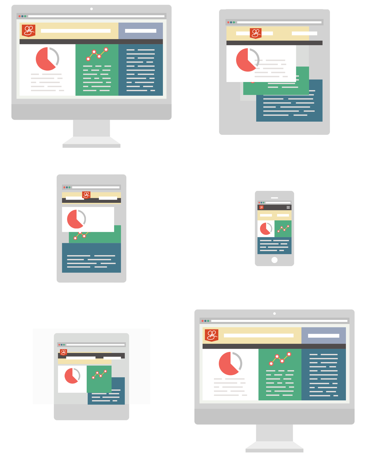
The best responsive websites utilize fluid grids, flexible images and specific CSS styling techniques to alter the website’s design and render it according to the width of the browser. You must ensure that you test your website on all browsers, not just your favorite or the most commonly used ones. Some browsers interpret CSS in different ways and require their own CSS properties to achieve a specific style.
W3schools offers thorough and comprehensive information on browser support that you should bookmark.
Do Not Become Dependent on Libraries and Frameworks
While there’s nothing wrong with becoming a master on a specific library or framework, it’s important to not exclusively rely on those methods. All libraries and frameworks are built by the native languages themselves and get updated and phased out constantly. If you have a solid understanding of the native languages, you can keep pragmatically learning, which will ensure your work will stay up to date.
Be Conscious of Page Speed
The time it takes for your website to load matters a lot. While page speed is usually not an issue with smaller websites, more robust and dense sites can and will take longer to load. It’s true that in some cases, there will be factors that are unavoidably impacting your page speed. However, there are a few main best practices that you should always take to ensure your website is a size efficient as possible.
Image Files
Be conscious of the image sizes you actually need. A large image is going to take a long time to load up and will use a significant amount of your bandwidth. If you have a lot of large images on your website, you’re adding extra loading time for every picture.
The file format is important too. Browsers can load JPG, PNG, and GIF images nice and quickly. But, heavy formats such as TIFF or BMP are going to increase chunks into your load time.
If you use WordPress, some common plugins you may use that automate the process of compressing and optimizing your images are Optimole, Imagify Image Optimizer, and Compress JPEG & PNG Images by TinyPNG. If you do not utilize WordPress but have Adobe Photoshop, learn more about exporting your images for web watching YouTube tutorials or other online references.
Text Graphics
Avoid using images to display text whenever possible. Again, images take up more room than text, even if the text needs a heavy amount of styling.
Code Density
Optimize your code as much as possible. Large, dense code will slow down your website, and your browser needs more time reading the large code. Reusing styles for similar elements will help shorten your CSS files. Keep your JavaScript DRY (do not repeat yourself).
If you find yourself having to write almost the same code over and over, consider creating a function to do it for you.
Plugins and Packages
If you WordPress or other similar content management systems that support plugins, you’ll likely find yourself taking advantage of them. Choose your plugins wisely. The more plugins you use on your site, the more weight your site has to carry. Some plugins may contain other components that you do not plan on using, which is essentially a waste of space.
If you do use any plugins or packages, ensure that you’re always keeping them up to date. Each update will ensure your website is not only stable and secure but may also decrease the size of the plugin or package overall.
Never Stop Learning
Technology is improving at an ever-increasing rate, and there has never been a better time to become an autodidact than now. The tools you use today will drastically change throughout your career. A big part of being a developer is learning, as it’s something you’ll never stop doing. With that said, having the ability to never stop learning is one of the top website development best practices.
There are a ton of free and affordable resources available online. If a new language or practice hits the Internet and becomes mainstream, do not resist it. It may seem pointless in some cases but understanding how new languages or practices work will ensure that you’ll be ready to tackle any problem your work may throw at you.


